.*. S .*. P .*. I .*. N .*. S .*. E .*. L .*. S .*.

• • • • • • on letters, words, books and graphic design • • • • • •

Fontstructing in the seventies Rob Ligtelijn

spotvogels

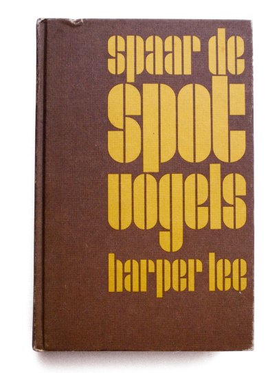
I found this book in a charity shop some time ago. The choice of colour, the bold, clear approach and the letterforms make it an iconographic example of seventies design. The lettering could have been designed in FontStruct, but the book is definitely too old for that. It looks like some sixties modular type I have seen before, maybe influenced by bauhaus typography. Searching on the web and in my specimen books didn’t bring up a match, so I decided to ask the designer of the book cover. If I was able to trace him…

The colophon mentioned no year of publication, but a postcard and a pocket calendar I found inside the book, suggested it was bought before 1975. And it did credit the cover design to one Rob Ligtelijn. Some googling led to the Facebook profile of a mister Ligtelijn who had been studying graphic design in Utrecht, the Netherlands. The first reply to my inquiry came from Chicago: Rob was traveling but had checked his e-mail on his iPhone. And he did remember the title of the book. Viva communication technology!

Two weeks later, Rob being back in Utrecht, this was his story.

“It sure was a surprise to be remembered about something I made that long ago! This must be from the early seventies. In those days I often started designing a cover from a typographic angle, especially when the content or title were hard to capture in one image. Occasionally I drew my own letters by hand – never a complete alphabet, just the ones I needed – and for every new job I started a new design.

This manual approach is obvious in the ‘spotvogels’ cover: the vertical line inside the letters has the same width all over. In a font it would have followed the type size. That would have made the image less calm and even.

What you have here is only the hard cover. The dust jacket is missing. I remember it had the text on the same spot, but there was a shadow, dropping 45 degrees to the bottom left, which sort of lifted the title up.

The drawing was done with a ruler and compasses, using pen and ink. Later we had those Rotring pens that prefered to leak when the job was almost finished. After that I used cutting film. Red transparent Letraset film was pasted onto paper. Those paper sheets had a millimetre pattern, printed in light blue ink that was invisible to the repro camera. Working on a light table, I applied close fitting colour fields – like the drop shadow I mentioned before –  to the back of the paper in mirror view. This way, occasional shrinking by moisture or heat was equal on both ‘plates’. Mirroring was no problem when handling originals on the camera.

Finaly I discovered masking film, made by Ulano. A clear transparent film, strong and dimensionally stable, with a red top coating that was easy to cut and peal off. At last easy correcting was possible! Wonderful material, albeit overhauled by new technologies.

I realize now I kept no work from that period. From book design my career shifted to art direction, over editorial work into publishing. The last years before retiring, I conceived magazines for different editors; the editorial concept or formula if you like. All related jobs, but I left the actual designing a long time ago. These questions and reading Spinsels make my hands itch again, though…”

Keep us posted, Rob, and thanks.

Harper Lee – Spaar de Spotvogels (To kill a Mockingbird)
Amsterdam Boek -Miljoenenreeks 1
Cover: Rob Ligtelijn

Filed under: book design, , ,

Spinsels has been fontfed…

SpinselsFontFed

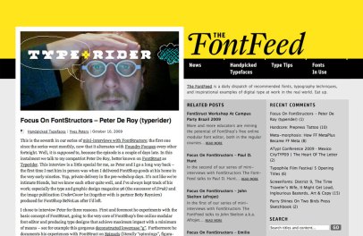
Somebody likes what we do! Yves Peeters from FontShop interviewed yours truly on the Fontfeed. About working with FontStruct and using it in type class.

Filed under: type & typography, ,

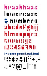
kraakhaas is the rebaptized crackhouse

FontStructor Paul Hunt pointed out that House Industries already have a font with the name Crackhouse. So I renamed my struction.
Thanks Paul. Sorry House Industries.
kraakhaassafekraak

Filed under: type & typography, ,

Sublimation wildclover fontstruct

wildclover-g

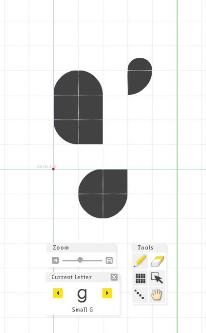
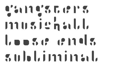
Currently working on wildclover, a Fontstruction that is trying to explore the boundaries of legibility by playing with inner and outer shapes. Some characters work fine, but the m and n are kids from the neighbours. x, y and z belong to the milk man, while v and w are even from another planet. To be continued…

wildclovertest

wildcloverglyphs

Filed under: type & typography,

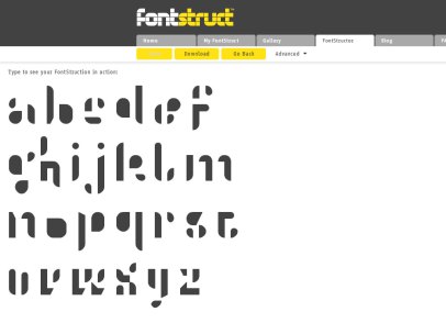
safehouse/crackhouse glyph overview

safehouseglyphscrackhouseglyphs

For links to and downloads from Fontstruct, see the former post.

Filed under: type & typography, , ,

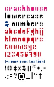
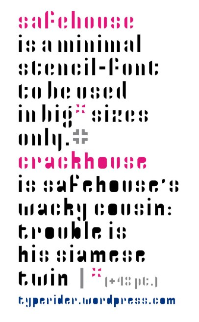
safehouse/crackhouse new fontstructions

safehouseweb

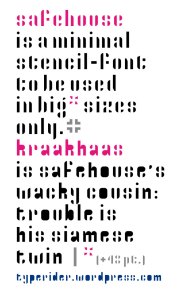
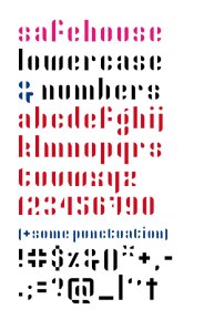
Two new small grid fontstructions I made in FontStruct. Safehouse is a minimal stencil font. Basics only: lowercase, numerals and some punctuation. The new spacing controls in FontStruct were a major help here: working in this small grid means that the vertical ‘stencil gap’ in each letter is as wide as the remaining strokes, so slightly widening the letter spacing makes it all more readable, albeit on the limit. Although the letterforms are almost falling apart, this little extra control made the experiment acceptable to me.
Crackhouse is the dirty version. Fun & streetwise.

Filed under: type & typography, , ,

Analog pixel art 4: another stitched alphabet

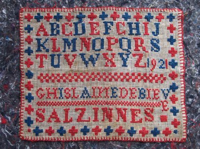
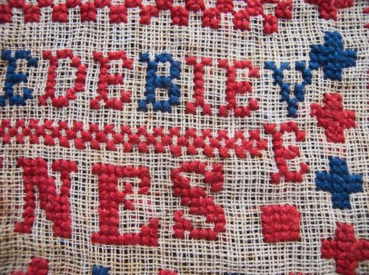
Ghislaine1

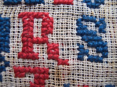
Another great exercise, dated 1921. While she has all the other N’s right, Ghislaine mirrored the one in her own name. I like this piece a lot. It looks very even at first sight, while looking closer reveals some patching up for miscalculation: notice how the last letter of the name didn’t fit, and simply drops. It helps to spread colour where the dot after ‘Salzinnes’ would have left a blank space if left on its own. The 1921 sits close, but doesn’t mess up the Z. And I fancy the R trying to leave the grid. Is it mimicking the Q’s tail?

Ghislaine3

Ghislaine2

Filed under: lettering, type & typography, , , ,

Bijloke bier

BijlokeBier

For this beer label, I adapted my Peghole Fontstruct to hang from the top instead of standing on a baseline. A special J was needed too… The backdrop was done in Illustrator.

Filed under: graphic design, lettering, type & typography, work, ,

analog pixel art 2

Today is mosaic day, or tiling day
if you like your mosaic a little more prosaic.
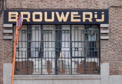
Brouwerij1

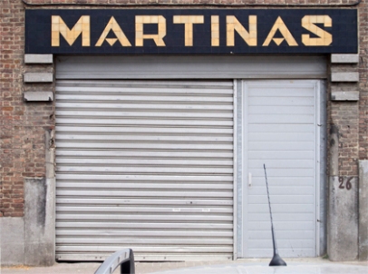
Martinas1

Pictures were taken in Merchtem, Belgium.
And ‘brouwerij’ means ‘brewery’. Cheers.

Brouwerij

Martinas

Looks very Fontstruct, not?

Filed under: graphic design, lettering, type & typography, , ,

Peghole Narrow Black

A wide version called for a narrow one. But narrowing a 3 block letter meant sacrificing the inner space. So Peghole Narrow automatically became Peghole Narrow Black. The hatches in the A, B, D, P and Q and several lowercase characters are no style gimmick but help to compensate for the lost inner space and increaselegibility. At least, that’s what I hope they do.

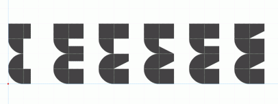
> variations on the capital E. Number 3 got the prize.

As always in FontStruct, changes open new paths. Trying to improve the dense lettershapes starts to alter the original feel of the Peghole font. Family ties are getting looser here. To be continued…

Filed under: type & typography, , ,